We've pilfered a great bit of content from the Guardian that we thought was too good not to share.
Infographics are a fantastic way to communicate complex messages in a clear and appealing manner. They're also highly shareable and so can be used as an powerful content marketing tool. So, how can a marketing agency use an inforgraphic to share a corporate message or statistical nugget effectively? Not like this:
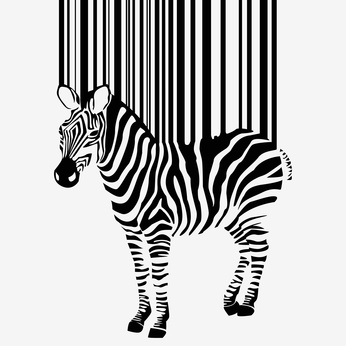
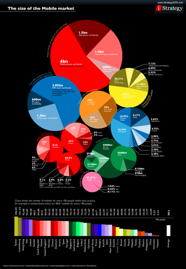
Make sure it's visually representational of the statistics
These are perfect examples of when the graphics don't match up to the numbers. They undermine the research and leave readers scratching their heads.
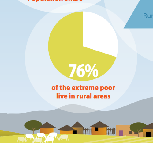
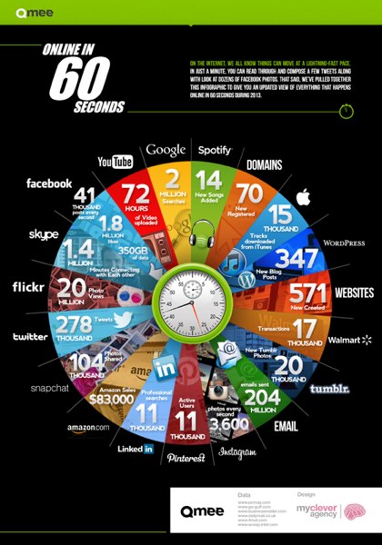
Don't over overcomplicate
Without a clear or comparible key or even an obvious context, infographics can get messy. But with an information overload and enough text to make Tolstoy jealous, these ambitious infographics are way off the mark.
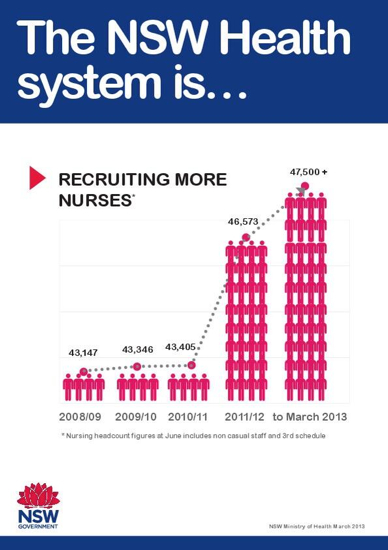
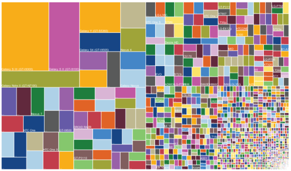
Don't get greedy with the graphs
Let's add another graph... and another... and another! Less is more in a work of statistical art. Marketing agencies take note.
Tips to bear in mind when creating infographics
These are all great examples of how in the misuse of effective tools, such as infographics, a marketing agency can alienate its audience, undermine their reputation and disguise interesting information.
According to Authentic.ly There are three main types of infographics:
- Data presented in a timeline
- Statistical data presented in graphs or with icons
- Data presented on a map
"In order to create an infographic which will be widely shared," they say, "think about your typography, colours, and layout. Make it easy for people to understand the information that’s being provided. Sometimes it’s best to keep things simple. Sometimes you don’t need anything more than an elaborate concentric pie chart or cool typography to create a visually interesting infographic."
Sound advice indeed (and some that should have been headed by the creators of these unsuccessful infographics).